Page 3 of 5
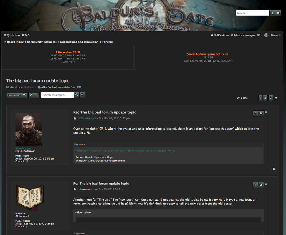
Re: The big bad forum update topic
Posted: Sun Dec 02, 2018 12:33 pm
by Planehopper
Over to the right (

), where the avatar and user information is located, there is an option for "contact this user" which quotes the post in a PM.
Re: The big bad forum update topic
Posted: Sun Dec 02, 2018 9:53 pm
by Maecius
Another item for "The List." The "new post" icon does not stand out against the old topics below it very well. Maybe a new icon, or more contrasting coloring, would help? Right now it's definitely not easy to tell the new posts from the old posts:
Re: The big bad forum update topic
Posted: Mon Dec 03, 2018 5:30 am
by Valefort
Tables don't seem to work, not too important though, lists will do for now

Re: The big bad forum update topic
Posted: Mon Dec 03, 2018 12:45 pm
by Glowfire
I can't recall if someone mentioned it already...
I don't see an option for a Reply All button in PMs...? I might be looking in the wrong place, or it's gone.
Oh, oops. Disregard. I did find it.

Re: The big bad forum update topic
Posted: Mon Dec 03, 2018 1:45 pm
by Blackman D
i didnt read everything
anyone complain about the color text table missing?
and the profiles are on the wrong side! its so weird

Re: The big bad forum update topic
Posted: Mon Dec 03, 2018 3:39 pm
by Arn
It's there. It's that water drop icon, directly to the left of the font size button.
Ta-daa!
Re: The big bad forum update topic
Posted: Mon Dec 03, 2018 5:29 pm
by artemitavik
It doesn't seem the "parchment" button works at all. At least not for me.
Re: The big bad forum update topic
Posted: Mon Dec 03, 2018 6:43 pm
by Steve
I'm helping out Zanniej on the .css and layout for the upgraded Forum. Keep your observations coming regarding colors/backgrounds/layout.
Because I don't have direct access, I can't make live changes, and thus some things may change (badly) but within 24 hours (?) can be changed back. Also, changing for mobile will be...challenging.
But at least this way you can throw darts at me instead of Zanniej!!! Hi Z-man!
Example:
Re: The big bad forum update topic
Posted: Tue Dec 04, 2018 1:42 am
by electric mayhem
The Hiding Online presence doesn't appear to be working. Even after toggling the option on/off and relogging.
Re: The big bad forum update topic
Posted: Tue Dec 04, 2018 4:38 am
by Theodore01
The banner , the date / server address and the "new posts" part - are using half of the screen.
Would be nice, if they could be condensed. As that would leave more space for posts.

Re: The big bad forum update topic
Posted: Tue Dec 04, 2018 11:18 am
by VDub
Theodore01 wrote: ↑Tue Dec 04, 2018 4:38 am
The banner , the date / server address and the "new posts" part - are using half of the screen.
Would be nice, if they could be condensed. As that would leave more space for posts.
It would be cool if we could get that blank spot to feature random Realms lore.
Re: The big bad forum update topic
Posted: Tue Dec 04, 2018 1:30 pm
by Rasael
Forum banner doesn't redirect to the forum index.
It used to.
Re: The big bad forum update topic
Posted: Tue Dec 04, 2018 1:32 pm
by Rasael
Reply to topic: I suggest placing the 'Save draft' and 'Preview' buttons after submit, or preferably below submit.
Intuitively a user wants to submit a reply. Rarely a user will want to preview or save a draft response.
So placing the most common option first seems the user friendly thing to do.
Re: The big bad forum update topic
Posted: Tue Dec 04, 2018 1:33 pm
by Rasael
The mobile layout of the reply page is very poor.
The styling icons are practically indistinguishable.
It could use a good re-arrangement and styling update.
Re: The big bad forum update topic
Posted: Tue Dec 04, 2018 5:08 pm
by SoThereIWas
Rasael wrote: ↑Tue Dec 04, 2018 1:33 pm
It could use a good re-arrangement and styling update.
There are existing templates and what not for use.
The issue with a re-skin is, it might or might not be in any way shape or form compatible with any updates.
Point being that, custom is nice and all. And I assume that's what the old forums where with style and what not. (or even this new one) But they are a pain the backside with updates.
One of the better options are to have the default page used to what ever it comes with and altering minor things to make it look unique in it's own way.
compatible parent and child templates should also be in play in case one breaks and you have a fall back when something does.
Forums are not that hard to do necessarily, especially if PHPBB which is what this one looks like to me.
Overall point being made is: Keep it simple and your better off overall, go with pre-existing custom or make a whole new custom and other fancy stuff, you will have a lot of maintenance ahead of you.
With all that criticism said, thank you for your time and attempt with the forums, Zanniej.
Also I would appreciate it if you would not take any files out fully when trying to mess with the forums so it wont go down. I can't tell you how many times I have seen "template missing" or other stuff like that between then and now. You can copy and transfer existing files to and from as live, and alter as you go.
WinSCP is really nice for that if your on a Windows OS.
